Šarka Barber
The Story
The client, an independent barber with a growing client base and a distinct sense of style, was looking to build a visual identity that would stand out in a competitive market. With a deep appreciation for symbolism and a personal connection to magpies, she envisioned a logo that could reflect both her craft and personality. The goal was to create a design that would capture her attention to detail and the precision she brings to every haircut.
The Solution
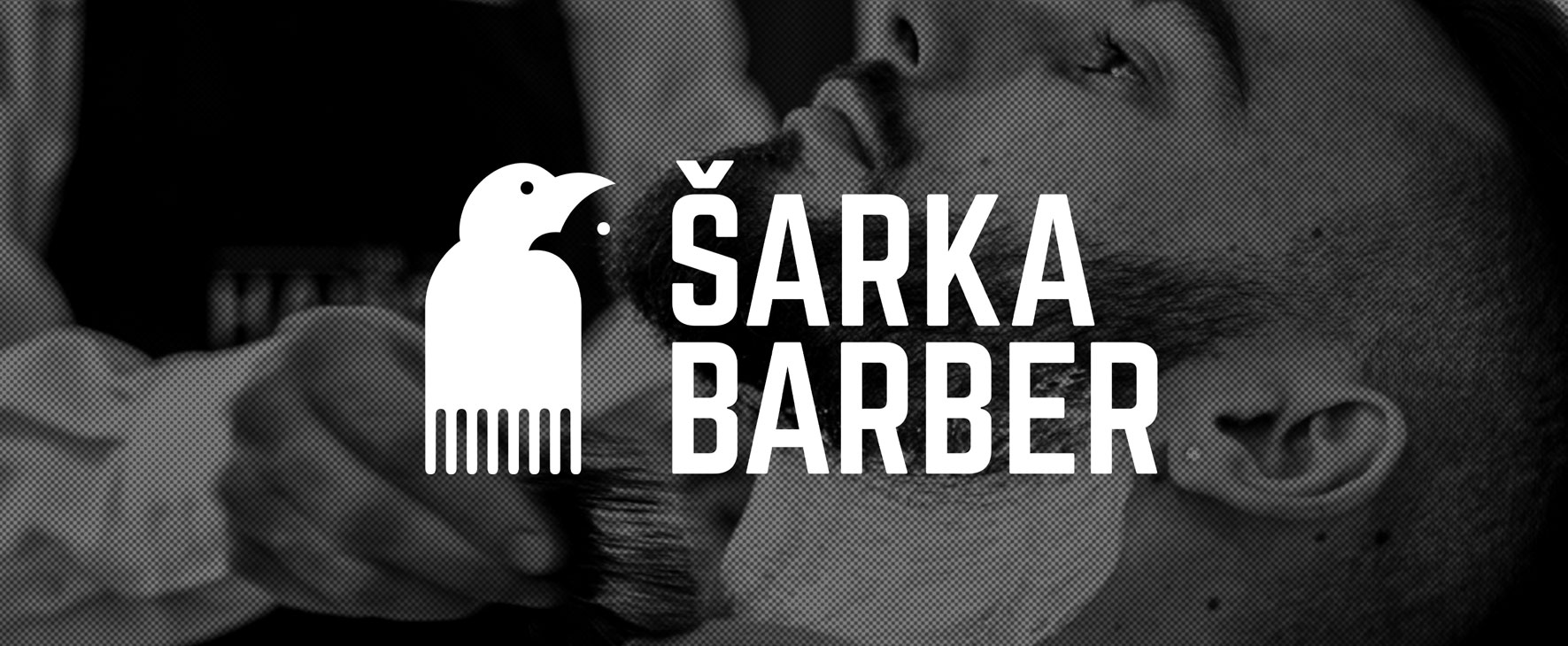
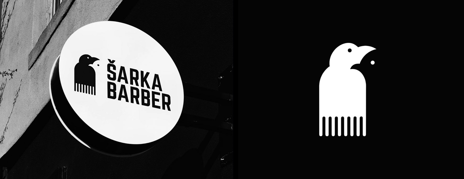
The final logo subtly merges the silhouette of a magpie with that of a razor, forming a cohesive and striking symbol that represents both the barber’s connection to magpies and her tools of the trade. Through the use of negative space, a second magpie figure emerges, representing the barber’s ability to spot and enhance even the finest details in her clients’ appearance. The result is a minimal yet meaningful design that feels modern, memorable, and reflective of the barber’s unique identity.